May 16, 2017 From rOpenSci (https://deploy-preview-121--ropensci.netlify.app/blog/2017/05/16/lingtypology/). Except where otherwise noted, content on this site is licensed under the CC-BY license.
As all other types of visualization, linguistic mapping has two main goals: data presentation and data analysis. The most common purpose for which linguistic maps are used, is simply pointing to the location of one or more languages of interest (presentation). A more sophisticated task is showing the distribution of particular linguistic features or their combination among languages of a certain area (presentation and analysis). There are three linguistic subdisciplines that use maps for visualization: linguistic typology, areal linguistics and dialectology. lingtypology makes it easier to create all kinds of linguistic maps simplifying both: data presentation and data analysis.
The lingtypology package connects the Glottolog database (v. 2.7), which is a catalogue of the world’s languages with the leaflet package for interactive maps. This package helps researchers to make linguistic maps, using the philosophy of the Cross-Linguistic Linked Data project, which is creating uniform access to linguistic data. Let me walk you through some of its functionalities!
 1. Installation
The package is available via CRAN:
install.packages("lingtypology", dependencies = TRUE)
However, as the package is still under construction, I would suggest users to download the development version instead, which is available at Github and can be accessed using devtools:
devtools::install_github("ropensci/lingtypology")
Since lingtypology depends on the leaflet package, it will work only with R version greater than or equal 3.1.0.
Load the package:
library("lingtypology")
 2. Simple maps
The main function for creating maps is map.feature(). Let’s create a map with some languages:
map.feature(languages = c("Irish", "Danish", "Rusyn", "Bebe"))

By using just one line we have created an interactive leaflet map. Each point on the map has a pop-up box that appears when the marker is clicked. The pop-up box by default contains the name of the language with a link to its page on Glottolog.
There are several functions in lingtypology for finding a language by affiliation, ISO-code or Glottolog code. For example, if you are interested in Lezgic languages and don’t want to list all of them separately, you can access them through the database with the following function:
lang.aff("Lezgic")
## [1] "Tsakhur"   "Aghul"     "Lezgian"   "Kryz"      "Rutul"
## [6] "Archi"     "Udi"       "Budukh"    "Tabasaran"
Most of the functions in lingtypology have the same syntax: what you need.what you have. So you can search for additional information such as area, country name, ISO code or glottolog code using the same syntax. See the package manual for a full list of functions.
area.lang(c("Bebe", "Irish")) #area
##      Bebe     Irish
##  "Africa" "Eurasia"
iso.lang(c("Adyghe", "Koasati")) # ISO code
##  Adyghe Koasati
##   "ady"   "cku"
gltc.lang(c("Nihali", "Malali")) # Glottolog code
##     Nihali     Malali
## "niha1238" "mala1432"
Using these functions you can do incredible things and easily create maps that haven’t been created before. Here is my favourite map with showing all Sign languages from the database.
map.feature(lang.aff("Sign"))
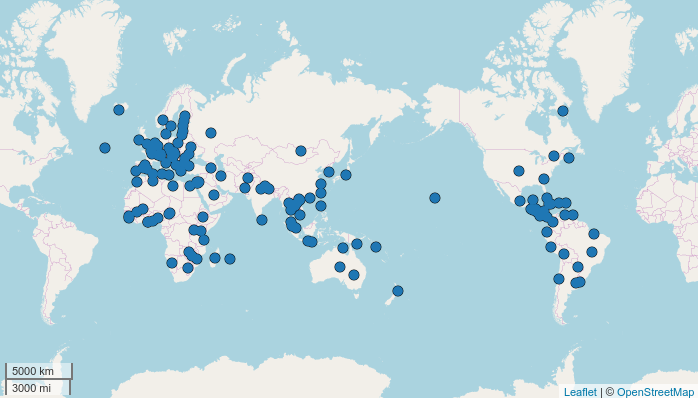
If you have a map with a lot of points it can be tiresome to have to click on each point in order to know which language it respresents. For this purpose, the ‘label’ argument can be used: it labels each point with a certain parameter, for example the name of the languages.
map.feature(lang.aff("Sign"), label = lang.aff("Sign"))
On this map, the labels are displayed on mouse over, but it is also possible to make the labels visible at all times. In this case I used the same vector as a language set, but it is possible to use any other vector (see example in the end of section 3.2).
 3. Show language features with a map
The main goal of the lingtypology package is showing different language features on a map. Let’s make an example using the built-in data set ejective_and_n_consonants, which contains 27 languages from the LAPSyD database. The dataset has two variables: the categorical variable ejectives indicates whether languages have any ejective sounds1, and the numeric variable consonants contains information about the number of consonants (based on LAPSyD database). I’ll make a little change in a dataset for my purposes:
df <- ejective_and_n_consonants
df$ejectives <- ifelse(df$ejectives == "yes", "with ejectives", "without ejectives")
 3.1 Colors
There is a feature argument that automatically colors points:
map.feature(df$language,
            features = df$ejectives,
            label = df$language)

You can change colors to your taste by the color argument:
map.feature(df$language,
            features = df$ejectives,
            label = df$language,
            color = c("blue", "tomato"))
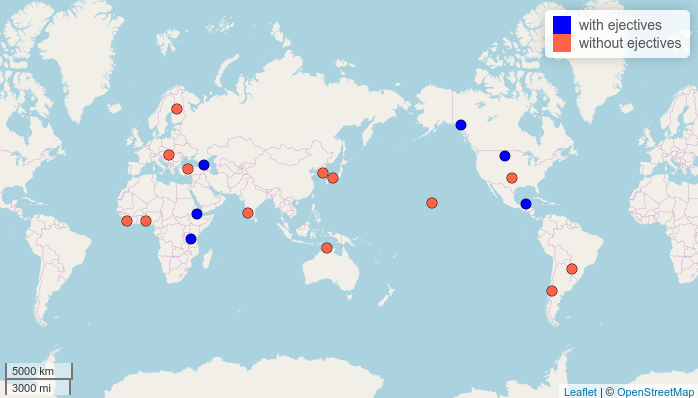
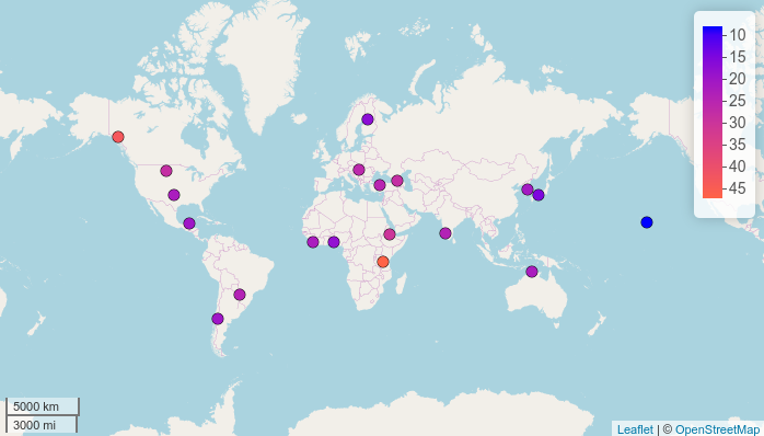
The color scheme works differently depending on the variable type. Let’s create a map based on a numeric variable, for example:
map.feature(df$language,
            features = df$consonants,
            label = df$language)
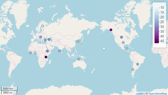
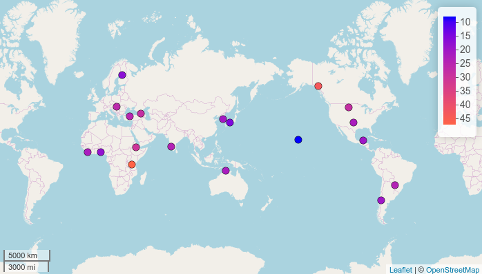
Again, the colors can be customized:
map.feature(df$language,
            features = df$consonants,
            label = df$language,
            color = c("blue", "tomato"))

There are two possible ways to show the World map: either with the Atlantic Ocean or with the Pacific Ocean in the middle. If you don’t want the default Pacific view, use the map.orientation parameter (thanks rOpenSci reviewers for this idea):
map.feature(df$language,
            features = df$consonants,
            label = df$language,
            color = c("blue", "tomato"),
            map.orientation = "Atlantic")
 3.2 Strokes
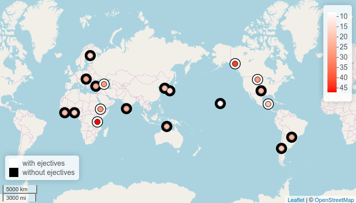
It is possible to show two independent sets of features on one map using an additional argument stroke.features.
map.feature(df$language,
            features = df$consonants,
            stroke.features = df$ejectives,
            label = df$language,
            color = c("white", "red"))
It looks like languages with ejective sounds tend to have more consonants! Information about the number of consonants can be added to the labels:
map.feature(df$language,
            features = df$consonants,
            stroke.features = df$ejectives,
            label = paste(df$language, df$consonants),
            color = c("white", "red"))
Strokes are a really nice tool, because at a certain density of parameters they merge and create a larger area with the same color.
 3.3 Pop-ups
Sometimes it is a good idea to add some additional information (e.g. language affiliation, references or even examples) to the pop-up boxes that appear when the points are clicked. Pop-ups are like tiny HTML pages, so we can even add videos!
How to say moon in different Sign Languages for example? In order to show this on a map, first of all we need to create a dataframe with links to videos:
sign_df <- data.frame(languages = c("American Sign Language",
                                    "Russian Sign Language",
                                    "French Sign Language"),
                      popup = c("https://goo.gl/La2Oab",
                                "https://goo.gl/lYVYbx",
                                "https://goo.gl/YRsqva"))
Then we need to change the links to HTML codes:
sign_df$popup <- paste0("<video width='200' height='150' controls> <source src='",
                        as.character(sign_df$popup),
                        "' type='video/mp4'></video>")
Now we can create a map:
map.feature(sign_df$languages,
            popup = sign_df$popup)

 3.4 Contour plot
It is possible to add isoglosses to a map using contour plots that are based on a kernel density estimation.
I will use a built-in dataset of Circassian villages in Russia that contains the genealogical affiliation of the language spoken in the respective villages, their geographical coordinates and the names of the districts in which they are located. Now let’s divide the villages into two regions based on the branch of Circassian that is spoken.
map.feature(circassian$language,
            features = circassian$language,
            popup = circassian$village,
            latitude = circassian$latitude,
            longitude = circassian$longitude,
            color = c("darkgreen", "navy"),
            density.estimation = "Circassian")
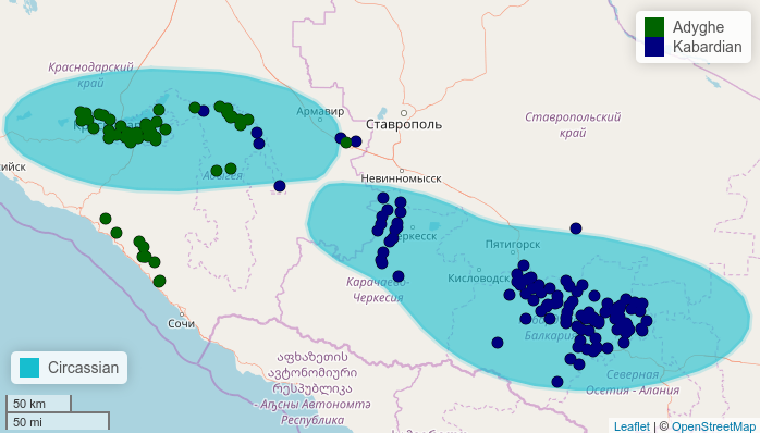
It is possible to change what is treated as the same area using density.longitude.width and density.latitude.width arguments.
map.feature(circassian$language,
            features = circassian$language,
            longitude = circassian$longitude,
            latitude = circassian$latitude,
            color = c("darkgreen", "navy"),
            density.estimation = "Circassian",
            density.longitude.width = 2,
            density.latitude.width =0.8)
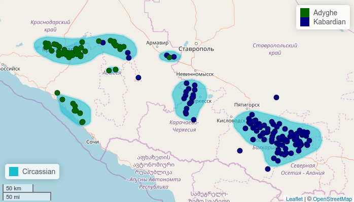
This example shows that it is also possible to add your own coordinates to the map.feature().
 4. Conclusions
In this post I showed the main fucntions of lingtypology for creating interactive linguistic maps, but there are a lot of other functions that make the visualizations more flexible, so take a look at the manual page for more information on functionalities.
If you have any suggestions, please create an issue on GitHub.
 5. Acknowledgments
I would like to thank Misha Daniel, Samira Verhees, Calle Börstell, Timo Roettger and Robert Forkel for their ideas and comments. I sincerely thank the reviewers for their constructive criticism and valuable comments during the rOpenSci reviewing: Kenton Russell, Taras Zahkarko, @languageSpaceLabs, Scott Chamberlain, and Stefanie Butland.
-
You can listen to the ejective p, ejective t, ejective k or ejective q via these links. If you are interested in the distribution of glottolized consonants, see the WALS chapter by Ian Maddieson. ↩︎

