September 25, 2018 From rOpenSci (https://deploy-preview-121--ropensci.netlify.app/blog/2018/09/25/smapr/). Except where otherwise noted, content on this site is licensed under the CC-BY license.
Hundreds of thousands of people in east Africa have been displaced and hundreds have died as a result of torrential rains which ended a drought but saturated soils and engorged rivers, resulting in extreme flooding in 2018.
This post will explore these events using the R package smapr, which provides access to global satellite-derived soil moisture data collected by the NASA Soil Moisture Active-Passive (SMAP) mission and abstracts away some of the complexity associated with finding, acquiring, and working with the HDF5 files that contain the observations (shout out to Laura DeCicco and Marco Sciaini for reviewing smapr, and Noam Ross for editing in the rOpenSci onboarding process).
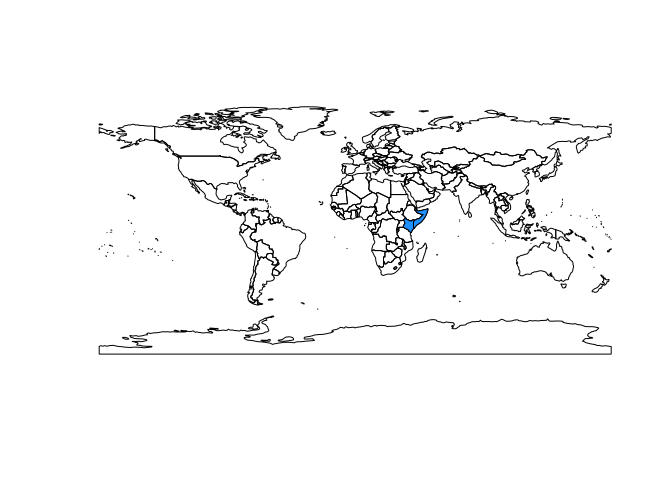
We will focus on Somalia and Kenya, two of the hardest hit countries.
We’ll also lean on another rOpenSci package, rnoaa, to link precipitation to soil moisture.
First, let’s get spatial boundaries for the study area:
library(raster)
library(tidyverse)
library(smapr)
library(rworldmap)
library(rnoaa)
library(plotly)
library(rasterVis)
library(animation)
library(patchwork)
library(sf)

worldmap <- getMap()
study_area <- subset(worldmap, NAME_SORT %in% c('Somalia', 'Kenya'))
study_area_sf <- as(study_area, 'sf')

plot(worldmap)
plot(study_area, add = TRUE, col = 'dodgerblue')
 Finding soil moisture data
Next, we can use the find_smap function to find global soil moisture data for any day.
The SMAP satellite was launched in 2015 with two sensors: an active microwave sensor and a passive radiometer.
The active sensor has since failed, so we will use the radiometer data, specifically version five of the ‘SPL3SMP’ data product (for a full list of data products see https://smap.jpl.nasa.gov/data/).
find_smap('SPL3SMP', dates = '2018-03-01', version = 5)
##                               name       date                     dir
## 1 SMAP_L3_SM_P_20180301_R16010_001 2018-03-01 SPL3SMP.005/2018.03.01/
This returns a data frame with one row per file - we can see here that there is one file available for that date. If we wanted to search over a range of dates, we could provide a date sequence:
date_seq <- seq(as.Date('2018-03-01'), as.Date('2018-03-06'), by = 1)
files <- find_smap('SPL3SMP', dates = date_seq, version = 5)
files
##                               name       date                     dir
## 1 SMAP_L3_SM_P_20180301_R16010_001 2018-03-01 SPL3SMP.005/2018.03.01/
## 2 SMAP_L3_SM_P_20180302_R16010_001 2018-03-02 SPL3SMP.005/2018.03.02/
## 3 SMAP_L3_SM_P_20180303_R16010_001 2018-03-03 SPL3SMP.005/2018.03.03/
## 4 SMAP_L3_SM_P_20180304_R16010_001 2018-03-04 SPL3SMP.005/2018.03.04/
## 5 SMAP_L3_SM_P_20180305_R16010_001 2018-03-05 SPL3SMP.005/2018.03.05/
## 6 SMAP_L3_SM_P_20180306_R16010_001 2018-03-06 SPL3SMP.005/2018.03.06/
 Downloading and extracting soil moisture data
The download_smap function takes the results from find_smap and downloads files locally:
downloads <- download_smap(files, overwrite = FALSE)
downloads
##                               name       date                     dir
## 1 SMAP_L3_SM_P_20180301_R16010_001 2018-03-01 SPL3SMP.005/2018.03.01/
## 2 SMAP_L3_SM_P_20180302_R16010_001 2018-03-02 SPL3SMP.005/2018.03.02/
## 3 SMAP_L3_SM_P_20180303_R16010_001 2018-03-03 SPL3SMP.005/2018.03.03/
## 4 SMAP_L3_SM_P_20180304_R16010_001 2018-03-04 SPL3SMP.005/2018.03.04/
## 5 SMAP_L3_SM_P_20180305_R16010_001 2018-03-05 SPL3SMP.005/2018.03.05/
## 6 SMAP_L3_SM_P_20180306_R16010_001 2018-03-06 SPL3SMP.005/2018.03.06/
##                   local_dir
## 1 /home/rstudio/.cache/smap
## 2 /home/rstudio/.cache/smap
## 3 /home/rstudio/.cache/smap
## 4 /home/rstudio/.cache/smap
## 5 /home/rstudio/.cache/smap
## 6 /home/rstudio/.cache/smap
Next, we can list the contents of the files we downloaded.
These are HDF5 files, so each file contains multiple datasets.
For this data product, a soil moisture data set is named Soil_Moisture_Retrieval_Data_AM/soil_moisture, and we can use the extract_smap function to generate rasters from this dataset (see list_smap for a list of all datasets contained in any file):
sm_raster <- extract_smap(downloads, name = "Soil_Moisture_Retrieval_Data_AM/soil_moisture")
sm_raster
## class       : RasterBrick
## dimensions  : 406, 964, 391384, 6  (nrow, ncol, ncell, nlayers)
## resolution  : 36032.22, 36032.22  (x, y)
## extent      : -17367530, 17367530, -7314540, 7314540  (xmin, xmax, ymin, ymax)
## coord. ref. : +proj=cea +lon_0=0 +lat_ts=30 +x_0=0 +y_0=0 +datum=WGS84 +units=m +no_defs +ellps=WGS84 +towgs84=0,0,0
## data source : /home/rstudio/.cache/smap/tmp.tif
## names       : SMAP_L3_S//R16010_001, SMAP_L3_S//R16010_001, SMAP_L3_S//R16010_001, SMAP_L3_S//R16010_001, SMAP_L3_S//R16010_001, SMAP_L3_S//R16010_001
## min values  :                  0.02,                  0.02,                  0.02,                  0.02,                  0.02,                  0.02
## max values  :             0.9122642,             0.9390723,             0.9531010,             0.9122642,             0.9531010,             0.9390723
Let’s plot the RasterBrick to see what the soil moisture data look like:
levelplot(sm_raster)
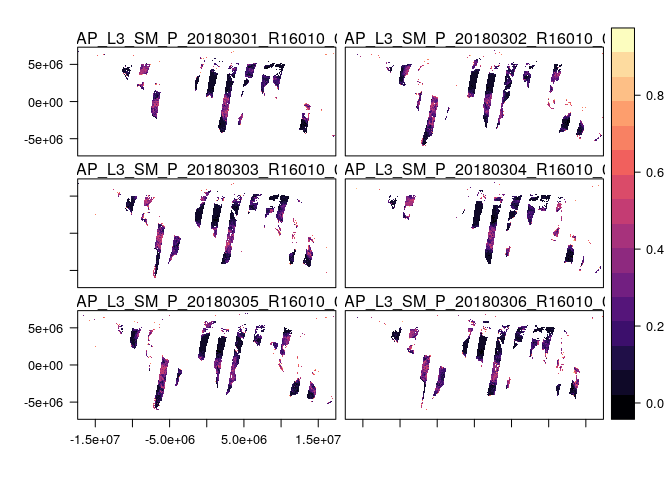
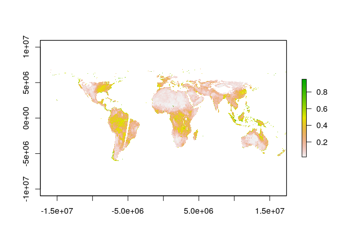
The striping occurs because of the orbit of the SMAP satellite. If we were interested in some weekly measure of soil moisture, we could simply average across days to get a more continuous picture of soil moisture:
weekly_sm <- mean(sm_raster, na.rm = TRUE)
plot(weekly_sm)
We’ll want to do that set of operations a bunch of times for this case study, so we’ll write a little function that takes a date range and returns a raster averaging over dates:
average_smap <- function(date_range) {
  mean_sm <- find_smap('SPL3SMP', dates = date_range, version = 5) %>%
    download_smap(overwrite = FALSE) %>%
    extract_smap(name = "Soil_Moisture_Retrieval_Data_AM/soil_moisture") %>%
    mean(na.rm = TRUE)
  mean_sm
}
Notice that spatial coverage is still not 100%.
Notably, places where the satellite missed and frozen regions in the arctic have NA values.
 Getting global precipitation data with rnoaa
We can better interpret soil moisture if we know about precipitation, and the NOAA Climate Prediction Center (CPC) has global precipitation data that are a cinch to get with the cpc_prcp function.
cpc_prcp('2018-03-01')
## # A tibble: 259,200 x 3
##      lon   lat precip
##    <dbl> <dbl>  <dbl>
##  1  0.25 -89.8      0
##  2  0.75 -89.8      0
##  3  1.25 -89.8      0
##  4  1.75 -89.8      0
##  5  2.25 -89.8      0
##  6  2.75 -89.8      0
##  7  3.25 -89.8      0
##  8  3.75 -89.8      0
##  9  4.25 -89.8      0
## 10  4.75 -89.8      0
## # ... with 259,190 more rows
Of course, we don’t want to get data just for one date.
Instead, just like we used a date range to get soil moisture data, we can get precipitation data for each date within a range using the map function from the purrr package.
We want to map the get_prcp function to each date in our vector date_seq:
date_seq %>%
  map(cpc_prcp) %>%
  str
## List of 6
##  $ :Classes 'tbl_df', 'tbl' and 'data.frame':	259200 obs. of  3 variables:
##   ..$ lon   : num [1:259200] 0.25 0.75 1.25 1.75 2.25 2.75 3.25 3.75 4.25 4.75 ...
##   ..$ lat   : num [1:259200] -89.8 -89.8 -89.8 -89.8 -89.8 ...
##   ..$ precip: num [1:259200] 0 0 0 0 0 0 0 0 0 0 ...
##  $ :Classes 'tbl_df', 'tbl' and 'data.frame':	259200 obs. of  3 variables:
##   ..$ lon   : num [1:259200] 0.25 0.75 1.25 1.75 2.25 2.75 3.25 3.75 4.25 4.75 ...
##   ..$ lat   : num [1:259200] -89.8 -89.8 -89.8 -89.8 -89.8 ...
##   ..$ precip: num [1:259200] 0 0 0 0 0 0 0 0 0 0 ...
##  $ :Classes 'tbl_df', 'tbl' and 'data.frame':	259200 obs. of  3 variables:
##   ..$ lon   : num [1:259200] 0.25 0.75 1.25 1.75 2.25 2.75 3.25 3.75 4.25 4.75 ...
##   ..$ lat   : num [1:259200] -89.8 -89.8 -89.8 -89.8 -89.8 ...
##   ..$ precip: num [1:259200] 0 0 0 0 0 0 0 0 0 0 ...
##  $ :Classes 'tbl_df', 'tbl' and 'data.frame':	259200 obs. of  3 variables:
##   ..$ lon   : num [1:259200] 0.25 0.75 1.25 1.75 2.25 2.75 3.25 3.75 4.25 4.75 ...
##   ..$ lat   : num [1:259200] -89.8 -89.8 -89.8 -89.8 -89.8 ...
##   ..$ precip: num [1:259200] 0 0 0 0 0 0 0 0 0 0 ...
##  $ :Classes 'tbl_df', 'tbl' and 'data.frame':	259200 obs. of  3 variables:
##   ..$ lon   : num [1:259200] 0.25 0.75 1.25 1.75 2.25 2.75 3.25 3.75 4.25 4.75 ...
##   ..$ lat   : num [1:259200] -89.8 -89.8 -89.8 -89.8 -89.8 ...
##   ..$ precip: num [1:259200] 0 0 0 0 0 0 0 0 0 0 ...
##  $ :Classes 'tbl_df', 'tbl' and 'data.frame':	259200 obs. of  3 variables:
##   ..$ lon   : num [1:259200] 0.25 0.75 1.25 1.75 2.25 2.75 3.25 3.75 4.25 4.75 ...
##   ..$ lat   : num [1:259200] -89.8 -89.8 -89.8 -89.8 -89.8 ...
##   ..$ precip: num [1:259200] 0 0 0 0 0 0 0 0 0 0 ...
Amazing!
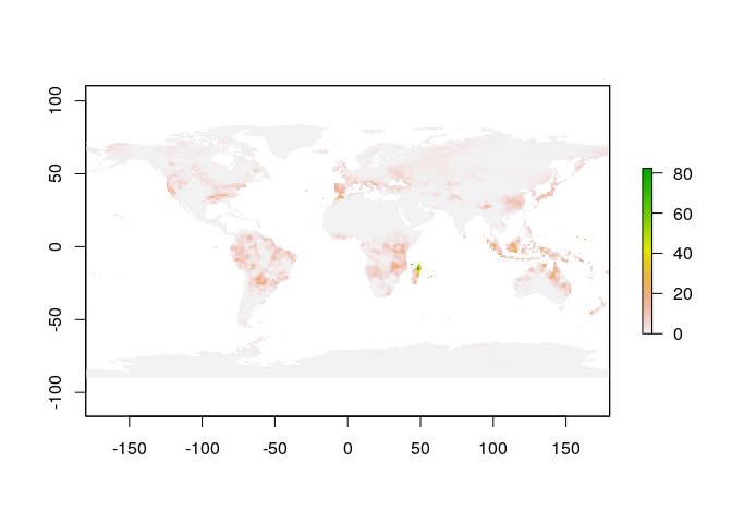
We now have a list where each element contains a data frame with the amount of precipitation over a consistent spatial grid that covers the whole globe, over a one week interval.
To merge these data frames together into one, we can use bind_rows, and we’ll also filter out NA values, which are represented as negative numbers:
date_seq %>%
  map(cpc_prcp) %>%
  bind_rows %>%
  filter(precip >= 0)
## # A tibble: 558,357 x 3
##      lon   lat precip
##    <dbl> <dbl>  <dbl>
##  1  0.25 -89.8      0
##  2  0.75 -89.8      0
##  3  1.25 -89.8      0
##  4  1.75 -89.8      0
##  5  2.25 -89.8      0
##  6  2.75 -89.8      0
##  7  3.25 -89.8      0
##  8  3.75 -89.8      0
##  9  4.25 -89.8      0
## 10  4.75 -89.8      0
## # ... with 558,347 more rows
Now we have one data frame, and we can compute a mean over all dates for each grid cell using a group_by, summarize operation.
date_seq %>%
  map(cpc_prcp) %>%
  bind_rows %>%
  filter(precip >= 0) %>%
  group_by(lon, lat) %>%
  summarize(precip = mean(precip, na.rm = TRUE))
## # A tibble: 93,060 x 3
## # Groups:   lon [?]
##      lon   lat precip
##    <dbl> <dbl>  <dbl>
##  1  0.25 -89.8      0
##  2  0.25 -89.2      0
##  3  0.25 -88.8      0
##  4  0.25 -88.2      0
##  5  0.25 -87.8      0
##  6  0.25 -87.2      0
##  7  0.25 -86.8      0
##  8  0.25 -86.2      0
##  9  0.25 -85.8      0
## 10  0.25 -85.2      0
## # ... with 93,050 more rows
One last little detail: the longitude values range from 0 to 360, but it’s going to be easier later if they range from -180 to 180, so we’ll use mutate to get longitude defined over (-180, 180).
weekly_pr <- date_seq %>%
  map(cpc_prcp) %>%
  bind_rows %>%
  filter(precip >= 0) %>%
  group_by(lon, lat) %>%
  summarize(precip = mean(precip, na.rm = TRUE)) %>%
  ungroup %>%
  mutate(lon = ifelse(lon > 180, lon - 360, lon))
We can generate a raster object by way of a SpatialGridDataFrame, which will be useful later to ensure that the soil moisture and precipitation data are on the same spatial grid:
# little helper function
make_precip_raster <- function(prcp_df) {
  coordinates(prcp_df) <- ~lon+lat
  gridded(prcp_df) <- TRUE
  prcp_df <- as(prcp_df, "SpatialGridDataFrame") # to full grid
  proj4string(prcp_df) <- '+proj=longlat +ellps=WGS84 +datum=WGS84 +no_defs'
  raster(prcp_df)
}

# create a precip raster
pr_raster <- make_precip_raster(weekly_pr)

# plot it
plot(pr_raster)
Just like we did for the soil moisture data, we’ll bundle up all of these steps into a helper function:
average_precip <- function(date_range) {
  date_seq %>%
    map(cpc_prcp) %>%
    bind_rows %>%
    filter(precip >= 0) %>%
    group_by(lon, lat) %>%
    summarize(precip = mean(precip, na.rm = TRUE)) %>%
    ungroup %>%
    mutate(lon = ifelse(lon > 180, lon - 360, lon)) %>%
    make_precip_raster
}
 Fetching global soil moisture and precipitation from 2015 to present
Now we have two functions average_smap and average_precip that we can use to get global soil moisture and precipitation data for any date range.
Next, we’ll use these functions to get data at weekly intervals from the beginning of the SMAP data archive in 2015 through the end of August 2018.
start_dates <- seq(as.Date("2015-04-01"), as.Date("2018-09-01"), by = 7)
end_dates <- start_dates + 6

weekly_smap <- vector(mode = 'list', length = length(start_dates))
weekly_precip <- vector(mode = 'list', length = length(start_dates))

for (i in seq_along(start_dates)) {
  date_seq <- seq(start_dates[i], end_dates[i], by = 1)

  geotiff_name <- paste0('sm-', i, '.tif')
  if (!file.exists(geotiff_name)) {
    average_smap(date_seq) %>%
      writeRaster(geotiff_name)
  }
  weekly_smap[[i]] <- raster(geotiff_name)

  weekly_precip[[i]] <- average_precip(date_seq)
}
Now we have two lists, weekly_smap and weekly_precip, where each element is a raster.
We’d like to convert these to RasterStack objects, and get them on the same spatial grid, in the same projection as our study area polygon.
weekly_smap <- stack(weekly_smap)
names(weekly_smap) <- start_dates
weekly_smap <- projectRaster(weekly_smap, crs = projection(study_area))

weekly_precip <- stack(weekly_precip)
names(weekly_precip) <- start_dates
weekly_precip <- resample(weekly_precip, weekly_smap)
Now that we have RasterStack objects, we will create tidy data frames that we can use in ggplot2. Because the code to do this is the same for both objects, I’ll write a little helper function.
make_study_area_df <- function(raster) {
  raster %>%
      mask(study_area) %>%
      trim %>%
      as('SpatialPixelsDataFrame') %>%
      as.data.frame() %>%
      gather(date, value, -x, -y) %>%
      as_tibble %>%
      mutate(date = start_dates[as.numeric(as.factor(date))])
}

soil_moisture <- make_study_area_df(weekly_smap) %>%
  rename(sm = value)
precip <- make_study_area_df(weekly_precip) %>%
  rename(pr = value)
Let’s check these out!
soil_moisture
## # A tibble: 171,124 x 4
##        x     y date          sm
##    <dbl> <dbl> <date>     <dbl>
##  1  50.7  11.9 2015-04-01 0.185
##  2  51.1  11.9 2015-04-01 0.127
##  3  50.3  11.6 2015-04-01 0.337
##  4  50.7  11.6 2015-04-01 0.150
##  5  51.1  11.6 2015-04-01 0.139
##  6  43.2  11.3 2015-04-01 0.340
##  7  48.5  11.3 2015-04-01 0.557
##  8  48.8  11.3 2015-04-01 0.361
##  9  49.2  11.3 2015-04-01 0.398
## 10  49.6  11.3 2015-04-01 0.150
## # ... with 171,114 more rows
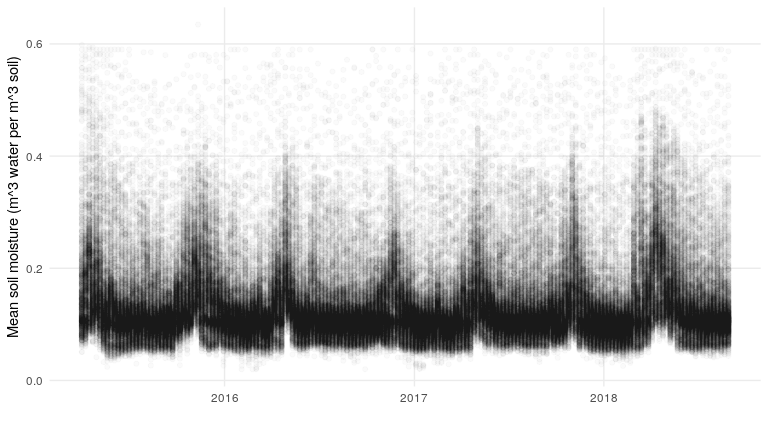
So we have a data frame where each row is a pixel with a date corresponding to the first day of the week, and then the mean soil moisture for that week in the sm column.
What do these data look like?
my_theme <- theme_minimal() +
  theme(panel.grid.minor = element_blank())

soil_moisture %>%
  ggplot(aes(date, sm)) +
  geom_point(alpha = .02) +
  my_theme +
  xlab('') +
  ylab('Mean soil moisture (m^3 water per m^3 soil)')
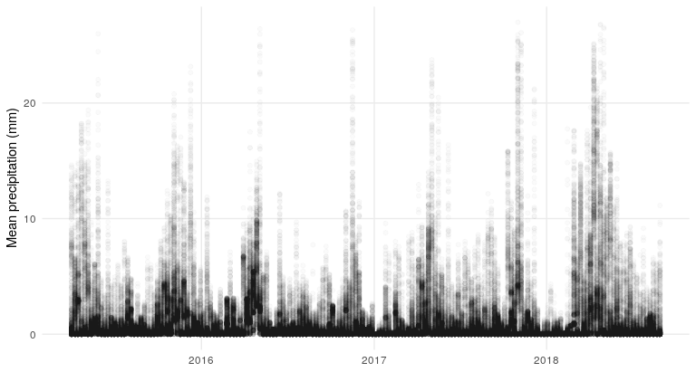
What about the precipitation data?
precip %>%
  ggplot(aes(date, pr)) +
  geom_point(alpha = .02) +
  my_theme +
  xlab('') +
  ylab('Mean precipitation (mm)')
What does the relationship between precipitation and soil moisture look like?
soil_moisture %>%
  left_join(precip) %>%
  ggplot(aes(pr, sm)) +
  geom_point(alpha = .02) +
  my_theme +
  ylab('Mean soil moisture (m^3 water per m^3 soil)') +
  xlab('Mean precipitation (mm)') +
  scale_y_log10() +
  scale_x_log10()
## Joining, by = c("x", "y", "date")
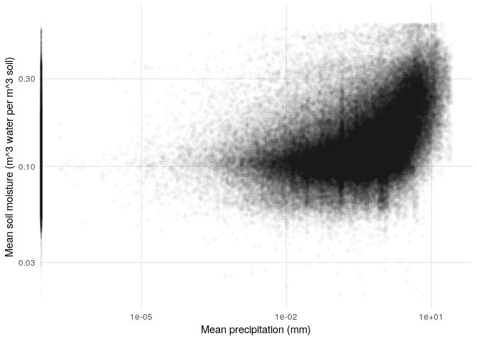
Notice the band of zero-precipitation points that sit on the y-axis. Among nonzero precipitation values, it seems like there is a nonlinear relationship between precipitation and soil moisture.
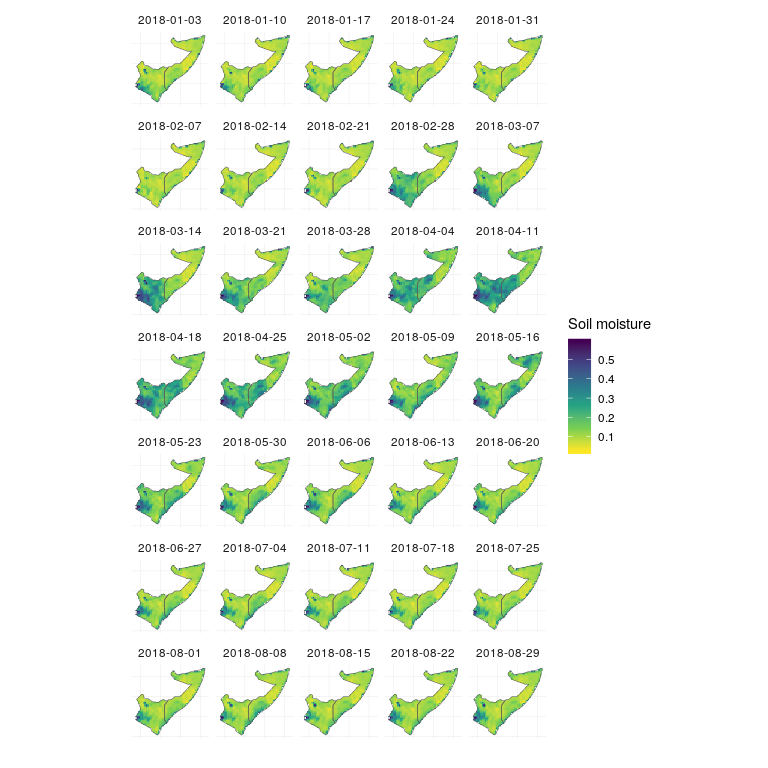
So, now let’s take a look at the spring and summer of 2018, when the flooding was worst in Somalia and Kenya.
soil_moisture %>%
  filter(date > as.Date('2018-01-01')) %>%
  ggplot(aes(x=x, y=y, fill=sm)) +
  geom_raster() +
  scale_fill_viridis_c(direction = -1,
                       'Soil moisture') +
  facet_wrap(~date, nrow = 7) +
  theme_minimal() +
  theme(axis.text = element_blank()) +
  geom_sf(data = study_area_sf, inherit.aes = FALSE, fill = NA, size = .2) +
  xlab('') +
  ylab('')
Soil moisture
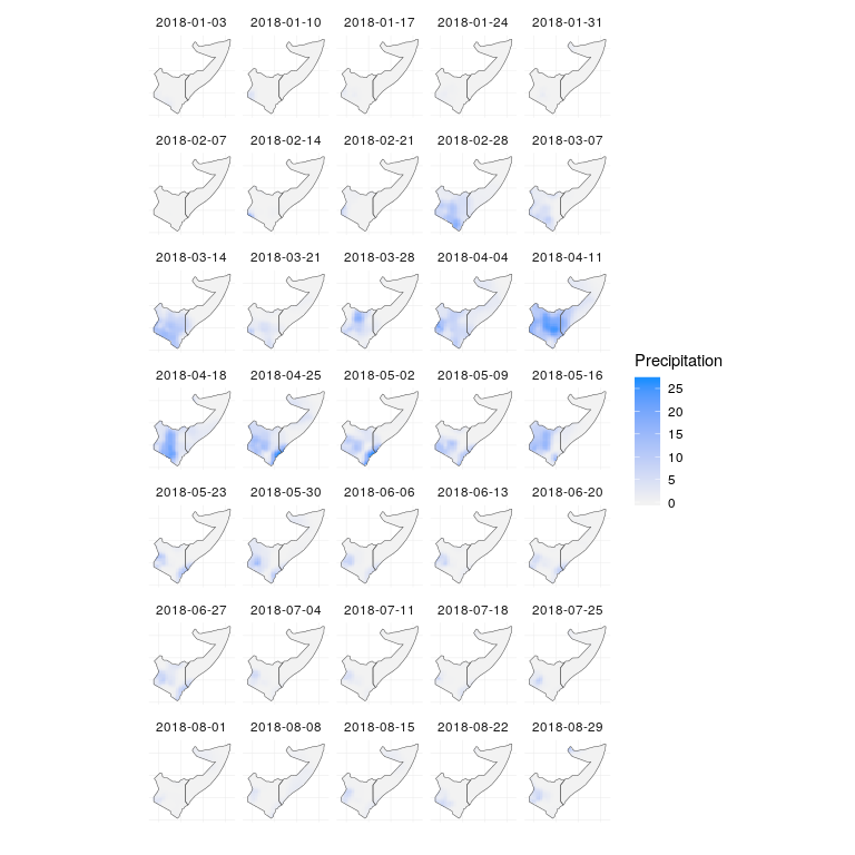
precip %>%
  filter(date > as.Date('2018-01-01')) %>%
  ggplot(aes(x=x, y=y, fill=pr)) +
  geom_raster() +
  scale_fill_gradient(low = 'grey95',
                      high = 'dodgerblue',
                      'Precipitation') +
  facet_wrap(~date, nrow = 7) +
  theme_minimal() +
  theme(axis.text = element_blank()) +
  geom_sf(data = study_area_sf, inherit.aes = FALSE, fill = NA, size = .2) +
  xlab('') +
  ylab('')
Precipitation
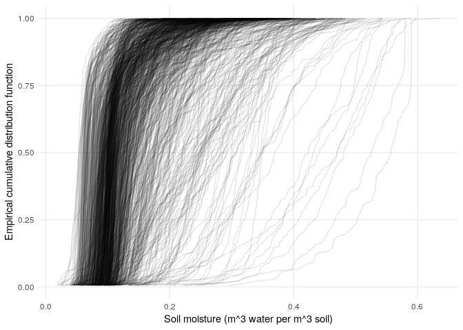
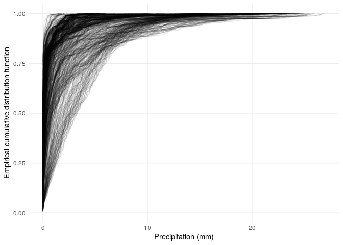
To get a sense for how these values compare to the overall distribution of values in space, we can plot the same data, but rather than using the soil moisture and precipitation values to color the map, we can color the map using the empirical cumulative distribution function (CDF). This will give us values between 0 and 1, which tell us the fraction of values below a particular value. So for instance if the empirical CDF at a particular value gives us 0.9, then 90% of the observations were less than that value. One quick thing to notice is that the distribution of values is different for every pixel:
sm_ecdf <- soil_moisture %>%
  group_by(x, y) %>%
  mutate(ecdf = ecdf(sm)(sm)) %>%
  ungroup

sm_ecdf %>%
  ggplot(aes(sm, ecdf, group = interaction(x, y))) +
  geom_line(alpha = .1) +
  my_theme +
  xlab('Soil moisture (m^3 water per m^3 soil)') +
  ylab('Empirical cumulative distribution function')
pr_ecdf <- precip %>%
  group_by(x, y) %>%
  mutate(ecdf = ecdf(pr)(pr)) %>%
  ungroup

pr_ecdf %>%
  ggplot(aes(pr, ecdf, group = interaction(x, y))) +
  geom_line(alpha = .1) +
  my_theme +
  xlab('Precipitation (mm)') +
  ylab('Empirical cumulative distribution function')
A few things to notice about these empirical cumulative distribution functions:
- The distributions of soil moisture and precipitation are quite different (e.g., the distribution of precipitation has a lot of zero values, and a long tail).
- The empirical CDFs provide a mapping from the range of data to the interval from zero to one, so that we can visualize how any particular amount of soil moisture or precipitation compares to the full distribution of values for each pixel. Essentially, when the empirical CDF gives a value close to 0, that’s a low value (a small fraction of values are less than or equal to it). If the empirical CDF gives a value close to one, that’s a high value (a large fraction of values are less than or equal to it).
Let’s see what the empirical CDF values look like on a map:
sm_ecdf %>%
  filter(date > as.Date('2018-01-01')) %>%
  ggplot(aes(x=x, y=y, fill=ecdf)) +
  geom_raster() +
  scale_fill_viridis_c('Soil moisture\nempirical CDF',
                       option = 'B', direction = -1) +
  facet_wrap(~date, nrow = 7) +
  theme_minimal() +
  theme(axis.text = element_blank()) +
  geom_sf(data = study_area_sf, inherit.aes = FALSE, fill = NA, size = .2) +
  xlab('') +
  ylab('')

precip %>%
  group_by(x, y) %>%
  mutate(ecdf = ecdf(pr)(pr)) %>%
  filter(date > as.Date('2018-01-01')) %>%
  ggplot(aes(x=x, y=y, fill=ecdf)) +
  geom_raster() +
  scale_fill_viridis_c('Precipitation\nempirical CDF',
                       option = 'B',
                       direction = -1) +
  facet_wrap(~date, nrow = 7) +
  theme_minimal() +
  theme(axis.text = element_blank()) +
  geom_sf(data = study_area_sf, inherit.aes = FALSE, fill = NA, size = .2) +
  xlab('') +
  ylab('')

Across much of Somalia and Kenya, soils were exceptionally dry prior to March 2018 (light colors), and with the prolonged levels of high rain beginning in March, soils were much more saturated than usual through mid to late May (dark colors). The rain throughout April fell on wet soils, which are less able to absorb water, leading to overland flow and flooding.
We can put this all together in a visualization that shows the evolution of soil moisture and precipitation:
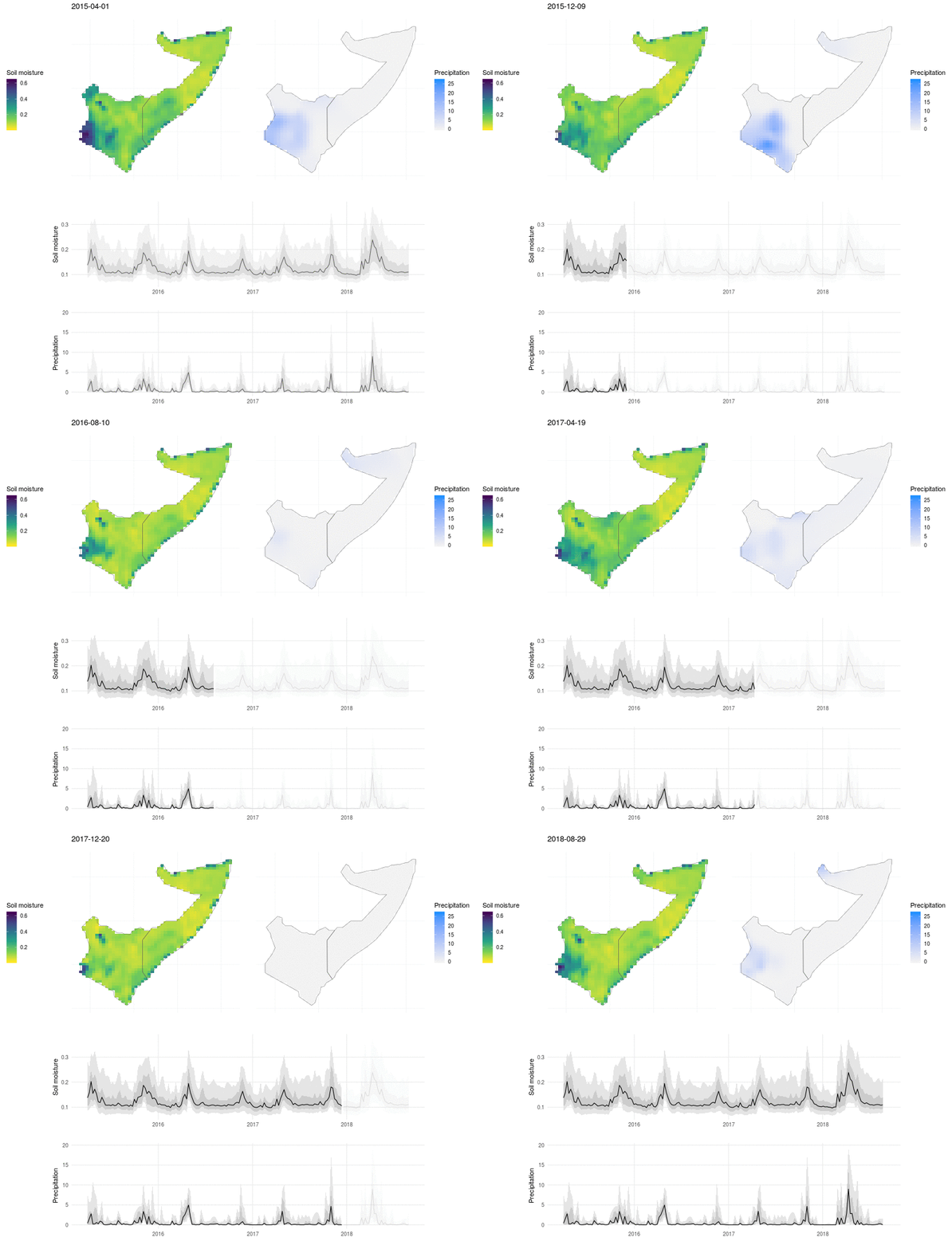
Here the soil moisture and precipitation values are mapped over time, with line plots below to show the median value (black line), interquartile range (dark grey ribbon), 10% and 90% quantiles (light grey ribbon). The exceptional nature of the flooding in 2018 shows up as a high and broad peak in soil moisture and precipitation, and the drought that preceded the flooding in 2017 is visible as a period of low rains and dry soil.
 Want to contribute?
If you’re psyched on global soil moisture and want to contribute to smapr, there is room to develop support for more level 2 products.
If you’re not familiar with the different levels of NASA data products: level 0 is the raw instrument data; level 1 is a bit more processed, e.g., the raw data with ancillary information; level 2 has derived geophysical variables; level 3 has these variables mapped on a uniform grid; and level 4 data consist of model output and derived variables.
Currently smapr supports the more processed level 3 science grade and level 4 enhanced value products primarily.
For a starting point, check out: https://github.com/ropensci/smapr/issues/35
 Acknowledgements
The smapr package was developed in Earth Lab with help from Matt Oakley who worked with the Earth Lab Analytics Hub.
The idea for the package emerged from a NOAA Data Partnership event in 2016, where we began working with the NASA SMAP data and realized that we had all the makings for an R package.

